How To Design Food App
Case study: Designing a food delivery app from scratch
![]()
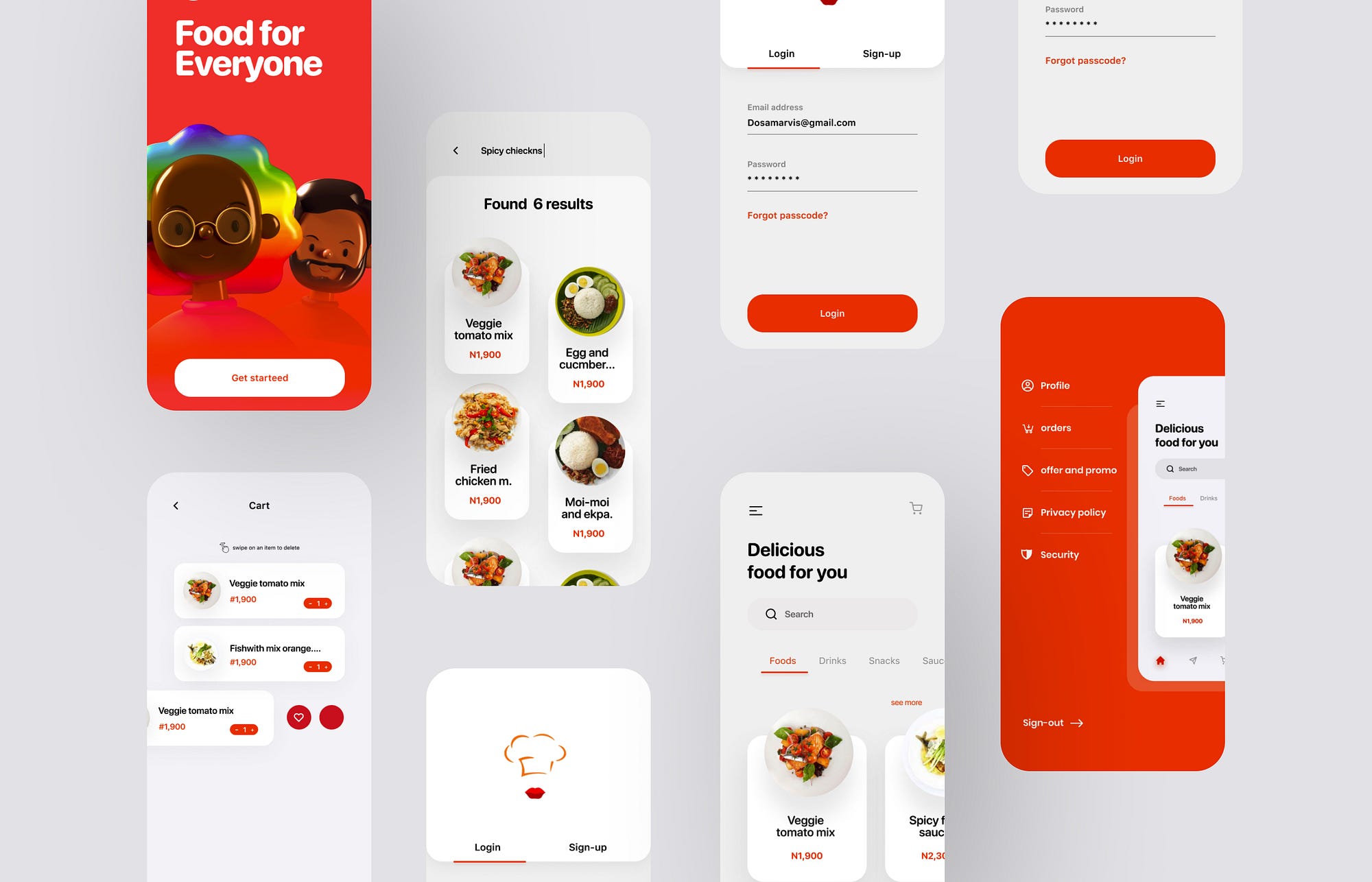
About
A client reached out to me for the design and also development for a food delivery app for her business called Bella Foods .The MVP and everything was designed and developed in three months, includes a shipment real-time tracking.The product was first directly launched on the market on google play-store , in order to test the traction and validate the idea before it was released in app store.
Role
- I started with competitive analysis by trying competitor apps and reading app reviews
- Conducted user interviews with users who order food online or eat out.
- Create and post user surveys online
- Participate in creating user personas
- Participate in UI sketching and ideation
- Create user flow diagrams in Miro
- Create low-mid hybrid screens in Figma
- Create low-mid and high fidelity prototypes in Figma also
Target and Challenge
Bella foods had a very clear target, a target that needs an extremely easy and fast to use solution. The app looks professional while also looking beautiful which distances itself from the normal food delivery app usage. Reliability was another key point: the real-time shipment tracking solves the usual shipment-related anxiety and builds trust from the first checkout.
Research
With the project idea defined, I searched the online for food delivery apps this gave me a better understanding of the existing food delivery apps out there. For each app, we identified what key features they had and read reviews to identify pain points and what features people want. We used this information to formulate our user interview questions and will revisit them when making workflow and design decisions.
Below are some ideas collected from user reviews:
- Need option to cancel order
- Need to be notified if delivery will be late
- Notification if dish is unavailable (suggest another)
- Option to add dish to favourites for easy reordering
- Reduce notification methods (app, phone, email)
- See order status and delivery ETA on home screen
- Show contact info of deliverer and restaurant
- Show order number with customer support phone number
User Interviews
I interviewed users to learn about the following:
- How often, why, when, and how they order food online
- Why they would choose one food delivery service over another
- Their experience using one of the food delivery services
- How food allergies influence their ordering experience
- How they discover new restaurants and dishes
- How they order food in the app
- Areas they think competitors can improve on
From the user interviews, we found that users are:
- Food-based or restaurant-based
- Price sensitive and are concerned of delivery fees
- Wanting more accurate order status notifications
- Visually driven (want pictures of dishes)
- Uninterested in supporting local businesses and organics
Planning
User Personas
From the user interview findings, we created 2 user personas, restaurant-based and food-based users. Restaurant-based users follow the existing model of food delivery apps where dishes are grouped by restaurant. Food-based users follow a new model where they are more interested in discovering dishes rather than restaurants.
Restaurant-Based
- Want to visit the restaurant first before ordering online
- Want to read restaurant reviews and blog mentions
- Usually order from the same restaurants
- Will use whatever food delivery app the restaurant endorses
"I usually order from the same pool of restaurants I like to go to. I don't like to order food from a new place without knowing what it's like beforehand."
"I really like Five Guys burgers so if I am too lazy to go over there and get one, I would just order it online."
Food-Based
- Look for food to satisfy one's cravings (impulse-based)
- Look at pictures to know what to expect
- Occasionally tries ordering from new restaurants
"I only read reviews of restaurants I find on Google, but not on Bella Foods. I believe in BellaFoods so if it's listed there, it should be good."
"I search what I want to eat, but not anything specific. For example, sushi or something with rice. Then I look at the food pictures."
Both
- Don't want to or couldn't cook or pick up food
- Values price, restaurant variety, delivery fees, and speed the most
- Looks at distance, reviews, pictures, and discounts when selecting a restaurant
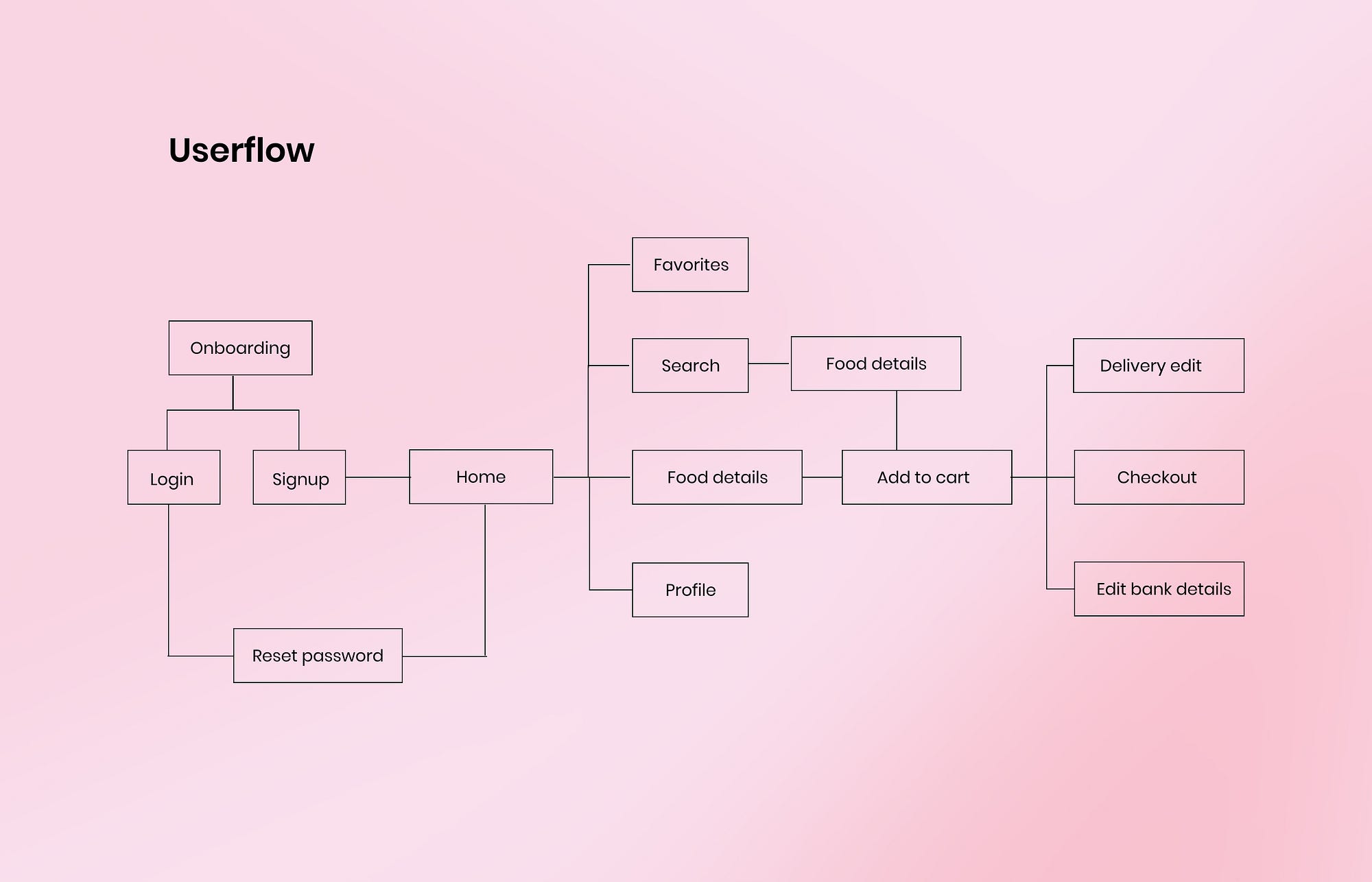
User flow
Here is a portion of the whole user flow showing the decisions that the user and system can make in the process of browsing through dishes.
Design and implementation
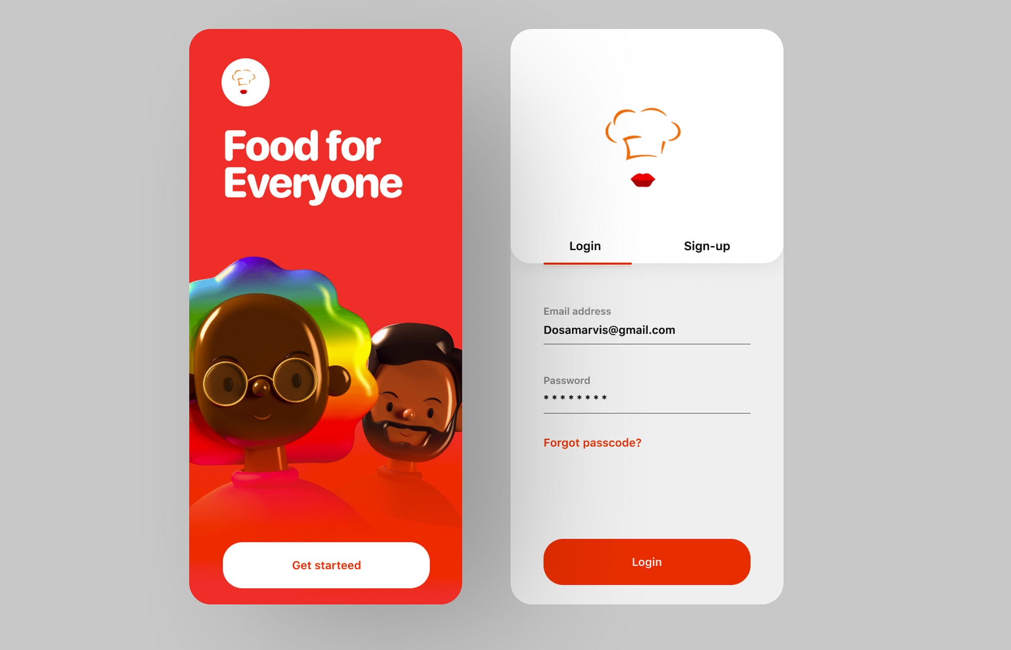
Splash screen and Login screen
Use of 3d free characters by a user on dribbble for the onboarding screen and also after some research i found out that users are in need when coming to the app, making the login, sign up screen quick to use and less clickable.
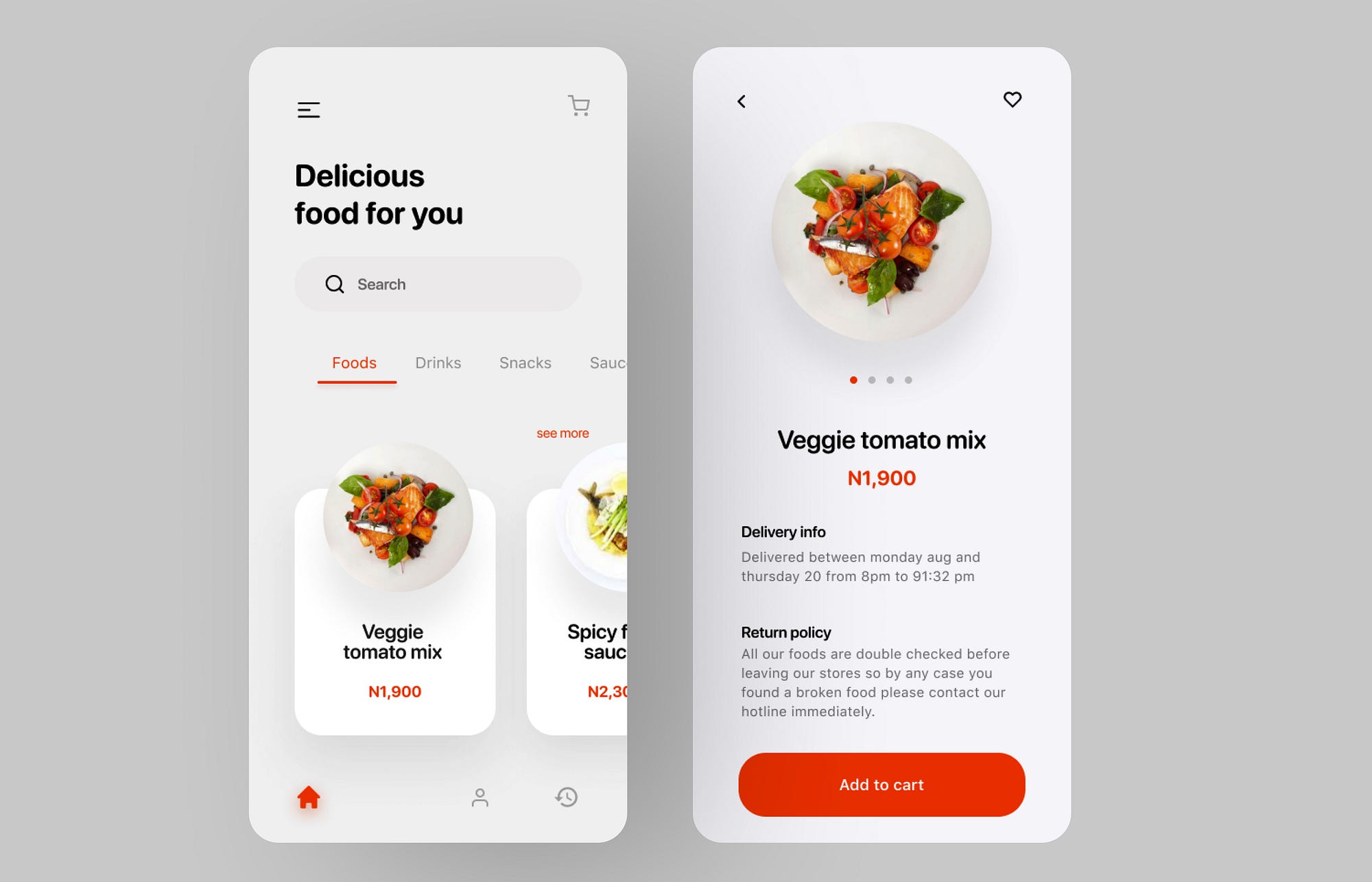
Home Screens
Shop, categories, and search: colors, font sizes, and product listing layout were determined by running multiple A/B tests. For the listing, it turned out that a grid arrangement slightly increased the conversions, thanks to its professionally shot pictures.
Other Screens
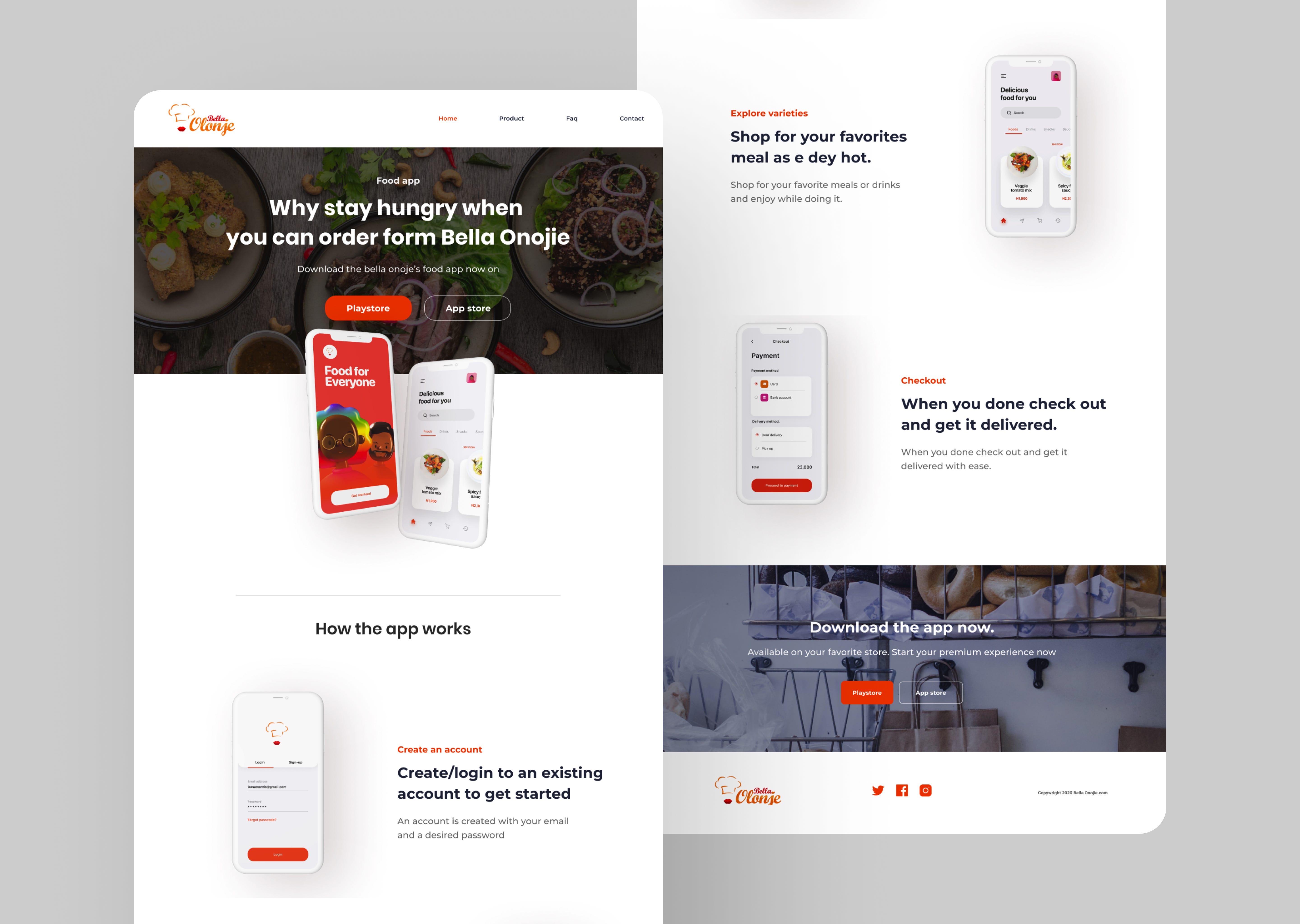
Website Design
Takeaways
It was a really interesting project and I'm pleased with how much we were able to get done in a small amount of time. To summarise, a key part of designing products is interacting with users early and often. Relying on our assumptions of the problems (and possible solutions) is never enough. It's also interesting to see how three small changes to the process could have such a huge impact on product usage as a whole.
Thanks a lot for reading all the way to the end. Please leave a comment and 👏🏻 if you enjoyed reading. You can follow me on dribbble if you'd like to chat about design or business. Also, leave a comment if you think there's something I missed out or if you have any thoughts at all. Cheers.
How To Design Food App
Source: https://bootcamp.uxdesign.cc/designing-a-food-delivery-app-from-scratch-a-ux-case-study-82fd100f4e6a
Posted by: finneyteredly.blogspot.com

0 Response to "How To Design Food App"
Post a Comment